Friday, February 28, 2014

Zebra Jacket

This is what it looks like when you take pictures of the project you just finished at 10:30 pm...after a full day of your toddler son refusing to be anywhere but in your arms or on your lap.  It's a good thing Q-ball is so cute.  But I was talking about the jacket.
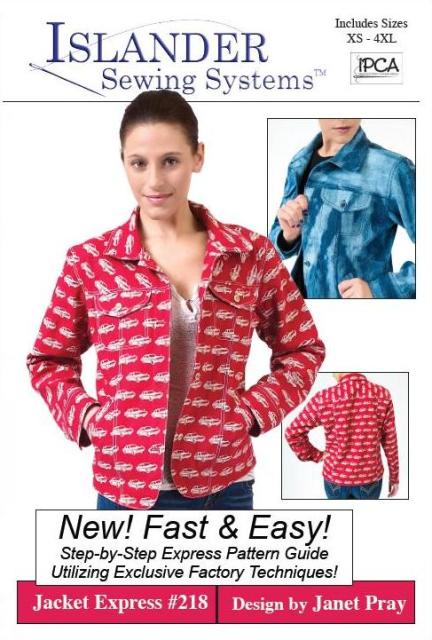
via sewing.patternreview.com
The pattern is Jacket Express #218 by Islander Sewing Systems.  It came with my purchase of the Craftsy class Sew Better, Sew Faster.  I can be a bit of a snob about what I think an online class can teach me about sewing but I was intrigued by the promise that the entire jacket could be sewn quickly and without any pins.  As the class was on sale for $20, I went for it.  The class includes the jacket, which usually costs $22.95, so I felt like I was getting a good deal.
It was late when we took this picture, thus the entire lack of styling.
I changed the pattern by squaring off everything but the pockets.  I was interested to try the crimping technique to give the round shape to the pockets so I kept that.  My fabric is a cotton blend of some sort I picked up at Hancock specifically to make the jacket.  The pattern is different from any others that I've used before.  The instructions are in a full color booklet and the order of construction is very different for most commercial patterns.  It's organized to be as efficient as possible.  That's great if the fit is already accurate.  Mine is a bit big in the back shoulders but not enough for me to pick it out and redo it.  I couldn't have known that until I was far into the sewing process.
This is as sassy as I get at the end of the day.
Construction was fairly easy, just time consuming because of all the pieces and all the topstitching.  I really did get most of the jacket sewn without using pins.  Even the sleeves were pin-less and that's something I'd never done before.  There are a few techniques that get a bit tricky to explain in writing and I had to figure those out for myself.  I have not yet watched the whole video on Craftsy because I needed to save time.  I'm sure she's got other tips for the tricky parts which are not included in the written pattern.
Welt pockets. I haven't done real welts in years.
I'll probably make this pattern up in the future with the necessary fitting modifications.  For now this is a great little number while Mother Nature decides whether or not it should be spring around here. She's a fickle mistress in March and April.  It's not uncommon to switch between heat and A/C in the car several times a day during these months.
What? Oh, you're taking the picture now?
I think I really need to watch the class video and see what other tips are there.  I wasn't a fan of trying to topstitch the facing and upper pockets without being able to see them, particularly without the aid of pins.  So I didn't.  Hopefully there's more info on that with the video.  I'll actually take the time to watch it before I make the next one.

Linking up:

Building a Better Wardrobe Giveaway

Tuesday, February 25, 2014

What's Black and White and Red(dish Orange) All Over?

I'll give you a hint...it's not a newspaper.  Remember that elementary school joke?  Anyway.  This is my signature style for Project Sewn.  I'm still figuring out exactly what my signature style is.  It's been evolving since I started Dressing Your Truth (not an affiliate link, but I get a reward) six weeks ago.  What I do know and have always known is that I like to dress my own version of comfy casual. My definition of comfy is great fit, distinctive/bold, and classy.  I also need to be able to chase my children.  I'm not a fan of plain t-shirts (on me), even for every day.  I like to feel put-together, but not overdressed for a stop at Walmart.  I'm going to keep the rest of this short and sweet because there's looooooots of stuff to say after making an entire outfit and I'll probably do a full post about each piece.
The Coat
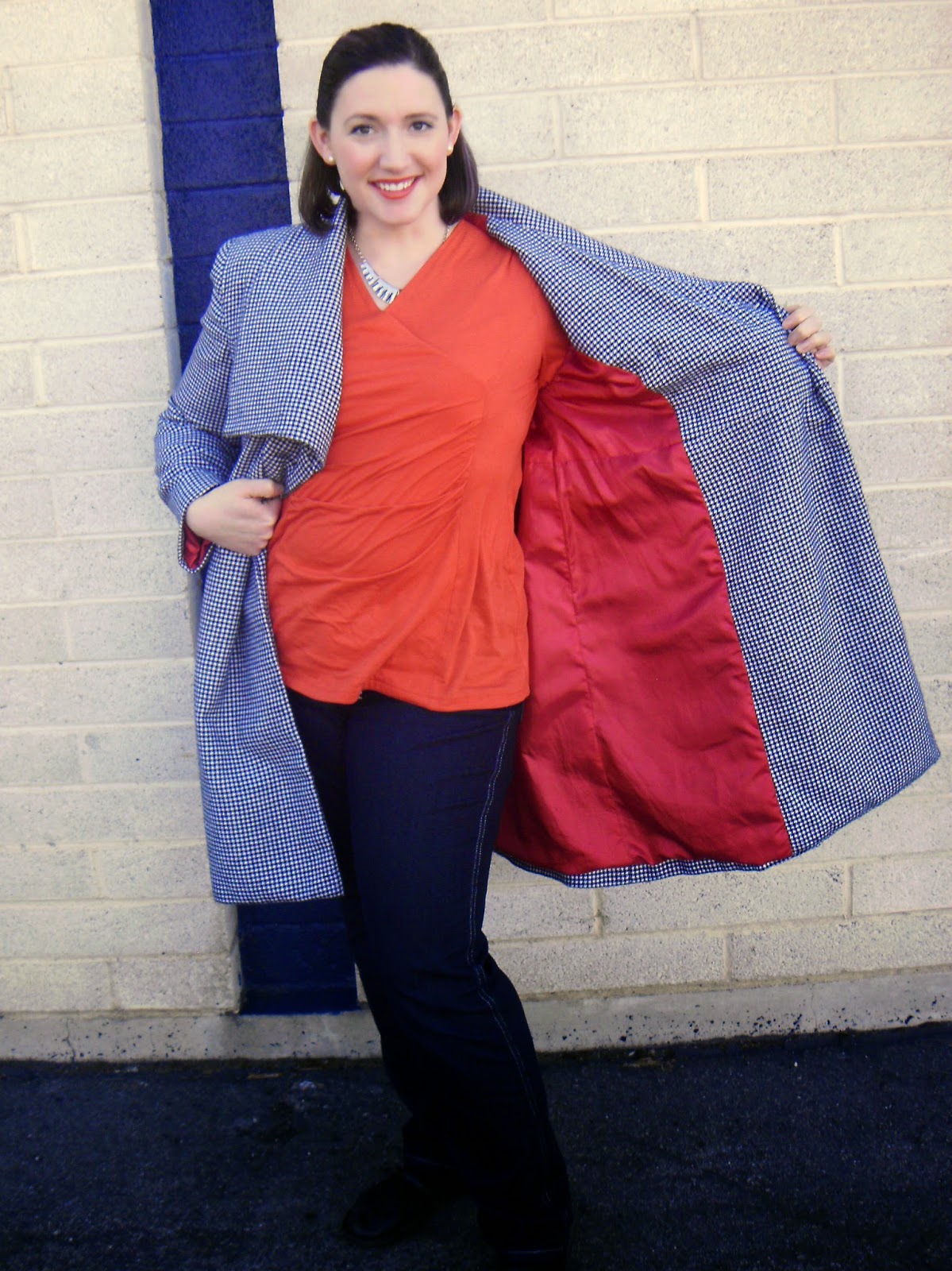
I've had the pattern and fabric for the coat for over a year.  Houndstooth is one of my favorite patterns. The wool is fairly thin so it also works well for days that aren't the dead of winter.  It was originally to be a weight loss reward last winter, but that didn't work out.  Then I was a little disappointed that I couldn't make it for this winter because I was going to be too pregnant.  That didn't work out either and I decided I deserved to have the coat regardless of weight loss.  I totally love the collar.  That top flap usually lies in a straight line but you know how it is when you try to take pictures...

The pattern is Butterick 5685.  Not so bad as patterns go, but there are a couple of changes I would make.  I'll go over that in another post.  I chose red for the lining because...well, why wouldn't I?  I stuck to the pattern pretty closely

The Top
The level of excitement I felt when I found the right color of orange fabric was almost indecent.  Until Dressing Your Truth I never would have worn orange.  I thought I couldn't pull it off.  Look at me now, pulling it off and being fabulous about it.  :)  The pattern is McCall's 6513.  I had to raise the shoulders, reset the sleeves and play around with the crossover bits on the front to achieve the right fit.  I changed the sleeve length simply because I like them better as 3/4 sleeves.
Bathroom selfie!
The Jeans
Yay jeans!  I have a weirdo lower body.  I've come to grips with it.  Really, once you have pants that fit properly it's easy to appreciate what you're born with.  The jeans pattern is McCall's 6610.  I did some heavy altering thanks to the Sewing Designer Jeans class on Craftsy.  By "heavy altering" I mean I shortened the rise, changed the waistband from straight to modified contour, slimmed the leg, made a front crotch adjustment, and changed the shape of the front pocket.  Easy cheesy, right?  Suuuure...

There's my bum in well-fitting jeans
To add contrast I used two strands of metallic silver thread for the topstitching.  I love all things sparkly, so I added some bling to the pockets.  I used a pre-made rhinestone design to begin with, then extended the design with more loose stones because my butt needed more shine.  Obviously.
There's a close up of my bum in well-fitting jeans
There were a couple of other fun touches I added.  The pocket bags came from scraps of a tropical print I used for who-knows-what.  I can't even remember except that I used some for the Origami Butterfly Wreath.


As another unique touch I squared out the stitching on the fly rather than use the half oval.  I also squared off the pockets.  To secure the fly facing I made three rows of bar tacks and repeated that design in other places where rivets would generally be used.  It all ties in pretty well, I think.
So there you have it, my signature style.  The fit is so perfect I feel like I melt into it.  The color is bold and the design is simple, but distinctive.I could go almost anywhere in my daily routine while wearing this get-up and feel perfectly comfortable.  I'm calling it a win.

Linking up:
Building a Better Wardrobe Giveaway

Monday, February 17, 2014

The Polka Dot Boring-er (Plus Dr. Who Geekery)

Any Dr. Who fans out there?  If you are then you'll get the "boring-er" reference.  If not, there's a little video at the bottom.  It doesn't necessarily explain much, but it does include the blue boringers.  Anyway.  My contribution to this week's Project Sewn sew-along has as much to do with my favorite Gallifreyan as it does with the shoes that inspired it.  The idea behind this week's theme of "If the shoe fits" is to choose a pair of shoes and make something to go with them.  I was a little disappointed because all my shoes are boring.  Like really, seriously boring.  Ultimately I ended up choosing these shoes:
They're old and dirty and they used to be gold.  I spray painted them a couple of weeks ago to breathe some new life into them.  That's when inspiration struck.  Rather than make something brand new to go with my boring old shoes, I could remake something old and boring into something new and fun.  I went with my once-beloved-but-now-meh polka dot dress.
The dress is too big and really long and just...boring.  Boooooooring.  Boring.  I used to like it a whole lot better but times have changed and I've moved on.  Until fixing the dress for this challenge, the only thing I could stand to do to make the dress wearable was to put my bright pink cardigan with it.
Much better, but still uninspiring
I love the polka dot pattern.  And that's all.  Time to refashion!  Yay!
This picture makes it look much longer in the front, but it's not.
The list of alterations is as follows: shorten skirt, take in bodice sides and reset the bottom of the sleeves (I'm always grateful for my background in alterations when I need to do that), cut and bind new neckline, add white fill in piece, switch out buttons, make ties into belt carriers, and pleat the front waist of the skirt.  Whoo, that was a lot!  After taking in the sides I replaced the skirt by matching the center backs on bodice and skirt.  I continued pinning them together as usual until I got to the skirt sides seams.  Those were several inches into the bodice front, as I had taken in about 5 inches on the sides seams, as well as using skirt fabric measured up from the original hem (which was wavy and I never noticed when it was around my ankles) rather than down from the waist.  The skirt had a slight a-line, which gave it extra fullness once I got it up to the empire waist.  After pinning to the side seams I matched the center fronts of bodice and skirt and then added pleats to the front skirt to keep the fullness and add interest.  After I cut the neckline down I needed to add the panel for modesty's sake (hello, world, meet my bra!) and personal comfort.  I originally made a different fill-in piece from leftover skirt fabric with pleating and binding to mimic the design on the rest of the shirt.  Once the fill-in was in place it ended up looking like an afterthought rather than an intended part of the design.  But I like the white inset quite a bit.  And I like not flashing people.
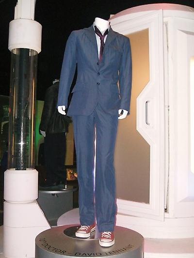
Warning: here's the part where I get my geek on.  I wore the red jeans (also self-made) as a tribute to the 10th Doctor's shoes.  He's my favorite by far, including his costume.  The combination of suit and Converse shoes makes me smile.  That's also why I added the pearls to my outfit--it makes the look both dressy(er) and casual.  And he has really great hair.  It's all sticky-uppy.
source  
My silver shoes are the same style as the 10th Doctor wears, just the wrong color.  In addition to the red pants, I also added a sash in what is surely the Doctor's favorite color.  "Hello, sexy."
A belt in TARDIS blue.  My waist is bigger on the inside.  ;)
The buttons have a black background with silver dots.  All of time and space on the front of my shirt.  I suppose I could say the same about the polka dots.

I don't have a sonic screwdriver so a Phillips head will have to do.
And we can't forget a nod to the 11th Doctor.  It took me a while to warm up to him.  10 was a hard act to follow.  I totally would have run away with him.  Or maybe I'm another Donna (also my favorite) and I just can't remember.
I don't have a fez but I DO have my son's bow tie.
 And here's that blue boringers video, featuring the 11th Doctor.  Enjoy.


Linking up:
Building a Better Wardrobe Giveaway

Sunday, February 9, 2014

Make It Pink: The Redemption Shirt

Dude, I am totally on top of projects for the Project Sewn sew-along!  Okay.  That's a lie.  I was going to skip this week altogether because 1) I didn't have any pink fabric and now's not the time to wander the fabric store without a specific plan (Oooo...pretty!  I'll take it all!) and 2) I jumped ahead to the Signature Style theme so I could get working on my jeans.  Happily for me, the sew-along contestants can enter anything they've made in the past six months.  Score!  I have only made one thing with pink in the past six months so that made it a breeze to narrow down my choices.  Ladies and gentlemen, I present...the Redemption Shirt.
There's the pink.  Promise.
This is a frankenshirt that wasn't actually planned.  It is a mix of three projects gone wrong and smashed together on the off chance that I could somehow make it work.  I used my beloved Vogue 8856 pattern because that seemed like my best options for piecing remnants into a workable whole.  I also used this pattern for my Jaded Stripes shirt.  The purple on the bottom is from a different shirt pattern that failed so completely (waaaaaay wrong body style for me) I didn't even try to alter it.  The pink panels on the sides were pieces of shirt that had been meant for embellishing.  Then one of my kids dumped nail polish on it in a place where adding embellishment would look bad.  Finally, the blue on the rest of the shirt is from a knock-off attempt at a DIY Moby Wrap.  I cut the fabric without any thought in my brain and slashed it up the wrong way.  Grrr...
Yes, yes, it's bad lighting on both pictures.  There's not much choice when the camera battery is almost dead, there are three children to be wrestled into bed, and you just want to get the blog post done now.
After making my usual adjustments at the waist, neck, and sleeves, it went together very well.  It's always a blast to do interesting seaming like that.  It felt good to redeem three failed projects and turn them into my best imitation of an Easter egg.  There was always something that felt a little off to me about the shirt.  Now that I've been learning about Dressing Your Truth I can see that the colors are Type 1 and I'm a Type 4. That explains things.

P.S.  Stay tuned for more on those jeans from the pictures.  They're going to show up again in week 4 of the Project Sewn sew-along.

Saturday, February 8, 2014

Staff Appreciation Week

Sewing aptitude does not automatically mean design or crafting aptitude.  For me, that means I need to STOP volunteering to do cutesy things.  I suffered an unfortunate bout of helpfulness (Help? You need help? Can I help? I love to help! Helphelphelphelphelp!) at the beginning of the school year and volunteered to be the AST Leader (basically a room mom on steroids) at Blue Eyes's school.  That means I'm in charge of coordinating the efforts of the other parents to be of maximum usefulness to the teacher.  That's not so bad until something needs to be done and there are no volunteers...then it's my job.  Crap.  No wonder I was the only sucker to sign up to be AST Leader.
Some people have the time and inclination to put this together.  Me?  Not so much...
via http://southlandvolunteers.blogspot.com/
This next week is Staff Appreciation Week at the school. I'm in charge of gifts for the teacher and her aide, as well as decorating the classroom door. Bother.  I didn't make it to any of the planning meetings, so I didn't know I was supposed to coordinate those. It wasn't until I got a call about the upcoming festivities that I realized I should probably do my job and that the excuse of my daughter having been in the hospital doesn't work six weeks after the fact. I sent a desperate email out to parents asking for help decorating the door because, as I said in the email, that sort of thing is totally beyond me.  When the response was a chorus of crickets I had a mild panic attack about what on earth I could possibly do for the door.  After a quick Google search I decided to just do a plain background in yellow (teacher's favorite color) with a massive green (aide's favorite color) book in the middle.  I would use my trusty marker to write "Once upon a time there was Mrs. T and Ms. H's class...and they learned happily ever after."  Easy cheesy.  Two people actually emailed me back to say they'd be there to help after I'd settled on an idea.
Also from http://southlandvolunteers.blogspot.com/
As I arrived at the school I was feeling self-satisfied that we would be able to bang out this little project in half an hour.  I gathered the necessary yellow butcher paper from the cart and happily made my way to the classroom.  I found one of my two helpers there.

Me: Hi!  Thanks for coming and helping!  Did you have an idea for the door?
K:  No.  I didn't really think about what would go with the theme.
Me:  With the what now?

Theme?  Theme?!  Crap.  The school-wide theme for Staff Appreciation Week is Hollywood.  As it turns out, I'd have known that had I attended the meetings.  Anyway, the Hollywood thing kind of tossed out the book idea.  The panic attacked again as I looked around to see all the other moms with the beautifully crafted, thoughtfully designed, themed motifs they were joyfully attaching to doors.  They had come with stars, Oscars, popcorn, and individualized pictures.  I had come with a Sharpie.
This is an acceptable design for a teacher door, right?
image via http://prenda11.blog.sbc.edu/
Creativity isn't always my strong suit, but practicality and pressure are my allies.  My helper, K,  and I stood, open-mouthed, trying to figure out what to do.  Enter my stream of consciousness:  Hollywood.  Okay.  Well, we've already got yellow paper. What's yellow?  Yellow brick road.  Emerald city!  Yes!  My helper suggested lettering for "There's no place like Mrs. T's class" and having her husband Photoshop a picture.  It could work!  It had to work!
Cutest Dorothy ever!
I sent K off to enlist her graphic designer husband's help while I covered the door.  Not as easy as it looks, folks.  Especially when you use the wrong tape the first time around and have to take it all down.  Then I pulled out a yard stick and started drawing the bricks for the road.  When K came back she had shapes for the Emerald City, a Photoshopped picture of Mrs. T as Dorothy (see above), and a print out of the words.  We lucked out even more when our door-decorating neighbor gave us punch out letters to use.  We were pleased with the result and basked in the praise we received from others who peeked in the door.  I went out looking for the right tape to put the paper back on the door and missed when someone came in, looked at my yellow brick road, and asked my helper, "She's OCD, isn't she?"  Maybe...
Yay for a door!
Not too shabby for a full 30 seconds of thought, eh?  It took way longer than my intended 30 minutes but the result was worth it for such a great teacher.  It was also nice to spend three and a half bonding with another mom that was freaking out as much as I was and doing what it took to get it done.  We joked about putting the teacher's face in as the Great and Powerful Oz.  My favorite idea (had we had more time, thought, desire, etc) was to get the students pictures and put them on the bodies of the flying monkeys.  That would have been awesome.  For now I'm just good to sit back and enjoy the victory of making it work when it just wasn't going to.  Take that, creative mommies!
Monday, February 3, 2014

Little White Dress


Oooohhh...I love this dress.  I've had my eye on it for a long time.  The lines of the dress are just so interesting.  Turns out the construction is really interesting too, but I'll get to that in a minute. It was fun to sew but, even better, I feel like a million bucks when I have it on.  The pattern is Vogue 1341, if you're interested. I've loved the pattern since the moment I first saw it.
I didn't so much love the deep plunge into the armpit, as that renders the dress unwearable to me.  Solution: interchangeable panels!  What could be more fun than that?  Channeling my inner Kate Middleton, that's what.
The Duchess of Cambridge in a little white dress and red fascinator
I made the dress and fascinator for two sewing activities.  The first is the Little White Dress contest on patternreview.com.  When I saw the contest I knew this pattern had to be the one I made.  I'm not sorry.  It's fabulous.  The other reason I made it was for the sew along on the first week of Project Sewn, the Fashion Icon Challenge.  It didn't take me long to realize that all I needed to do to make this project work for both activities was to make a fascinator and use Kate Middleton as inspiration.  If anyone is a modern style icon, it's Kate Middleton.  She is stunning and makes great fashion choices.  I used Vogue 8868.  There was no question that it would be purple.  It goes with my new hair.  :)
Me in a little white dress and fascinator
 I liked the clean, unfussy look of this fascinator
Turns out the fascinator is traditionally worn on the right side of the head.  We in the States drive on the opposite side of the road from the Brits so why not do the same with the fascinator?  Besides, it balances out the insert on my dress.  For the Little White Dress contest the challenge is to make a dress that is versatile enough to use in both the daytime and the evening, just like the iconic little black dress.  Challenge accepted.  Before I started constructing the dress I planned to put it into the rotation of dresses I wear to church.  Halfway through making it I was asked to be in with the 18 month to 3 year old kids at church, thus turning my pure white dress into a fish cracker disaster waiting to happen.  Oh, well.  Some day.
I styled my dress for the daytime in two ways.  The first was for a more formal daytime event, an art show. We went to where my cousin had some art displayed at a little cafe and took pictures there.  My dad was my gracious photographer.  I accessorized with a metallic silver purse, purple pumps, my fascinator, a sparkly bracelet and earrings, and a purple insert covered with lace left over from my wedding gown.  Oh, and a ginormous ring that is a replica of Kate's engagement ring.  I wore the fascinator flatter to my head, as per my own preference.
It only seemed appropriate to style the dress for work, as fancy daytime events are few and far between.  I'm a stay at home mom of three.  Fancy daytime events happen...never.  I guess I'll have to plan a killer tea party with Blue Eyes and the Pink Blur so we can have a great reason to dress up.  I chose to accessorize with a simple dress panel made of the same fabric, shiny silvery earrings, bracelet and watch, a simple black bag, and pointy scarlet kitten heels.  I pulled my hair back to hide the purple streaks which might be deemed unprofessional in an office setting.
For my evening look I used the same plain white panel to accent the dress.  I have very sparkly earrings (too bad you can't see them), black heels, a blinged-up black and white purse, and a bracelet of sparkly black beads interspersed with clear stones set in shiny silver square "beads".  I had fun carrying my mocktail glass and feeling like I was at some swanky party.  My pop of color was my hair, which I pulled back up to expose maximum purple.  I wish that showed up better on the pictures, too.  Oh well.  I didn't add a necklace to any of the looks because it would just compete with everything going on at the neckline.  This dress pretty much stands on its own.

One quick note about the construction: the way this dress is made is weirder than any other construction process I've ever done.  And that's saying something.  There are no side seams.  The front of the dress is formed by making tucks on the lower front  and joining it to the upper front with one ridiculously long dart that goes from behind the shoulder to past the center front.  I forgot to have my dad take pictures of the side and back.  The back seam curves from the underarm down to the center back and then stays on a straight line.  If that doesn't make sense then just click the link and scroll down to the line art.  It's crazy but it's a blast to sew.  The fascinator was an easy sew.  I like it so much that I may just make another of the views and see if I can find an excuse to wear it more often.

Linking up:
Building a Better Wardrobe Giveaway

Sunday, February 2, 2014

The Makeover

I have several sewing projects waiting for pictures so I can give them a blog post.  Until then, I can show pictures of my new hair.  I needed a new 'do to compliment me as a Dressing Your Truth type 4.  I went to the DYT salon to have my hair cut and dyed.  Loved it!

The "Before" picture was taken at the salon.  I purposely chose a shirt I knew was wrong (I still love it, even though it's a Type 2) so I could have a more dramatic "After".  I ran out of time to finish my makeup and didn't put on mascara.  That just makes the after better, right?  Right?
Before.  The shirt is a Type 2 shirt, so not my best look.
 The "After" picture was also taken in the salon.  My hair was styled, my makeup was touched up, and one of the employees at the store handed me a shirt and earrings to put on.  They are true to my Type and do more for me than my other shirt did.

I was most excited to get the purple added.  I'd been wanting to do that for quite a while.  It adds an element of fun and I can totally pull it off.  My husband likes it so well he wants me to keep it up.  We'll see if he still wants me to keep it up when he finds out how much it costs...
After.  Rockin' the purple.
In the interest of honesty, I also included and after picture in which I did my own hair and make up.  I don't know about you, but trying to duplicate what they do to my hair at the salon is an exercise in futility.  Even without the curl in my hair I am pleased.  Seriously, I'm really digging the purple.
After After.  No stylist to help me out and wearing all my own stuff.
The purple a fun change.  I love that it's kind of a peek-a-boo color.  I can style it so the color can't be seen from the front or so that it stands out, whichever suits my fancy.  Maybe next time I'll do red.